Heroku.com embodies what I like to see in a website that is trying to give me a product. All the information I need is right in front of me. I don’t have to scroll or take too long to search. I can figure out what the website is about right away. The navigation bar is very easy to use and understand. They are straight to the point. If I want to know how their product works, I click on “How it works.” If I need pricing, there is a page for that. The site also makes good use of animations to keep me interested. The overall color is quite nice as well. It looks very professional, yet fun. Overall the site is nice. The pages load fast, its easy to navigation, and is easy on the eyes.
Design critique for Chartbeat
Let me start off by saying that this site is cool. It looks fun. Anyone new to the internet will instantly be wowed. The colors were nice and they followed a nice theme. Even being as cool as it is, it’s not perfect. One problem is that I had to scroll down too far to actually find out what the company does. I wish that I knew as soon as I landed on the page. The second issue was that is was a bit choppy on chrome. It’s not enough to actually deter use or even noticeable by most people. I’m just picky I guess. The page does not leave disappointed though. Even at the bottom there are still some cool features like the pixel counter. At the end of the day Chartbeat is a good looking and fun website.
Design Critique for Etsy.com
The Etsy website is a great looking website. I mean, can we expect less? It’s a site made for artists. Everything just flows. The colors go with a theme. The navigation is easy. The site makes it easy to register and sign in. It’s quite easy to organize the site to find items that you are looking for. All of the linked pages make it easy to always go back to the home page.

You can't have a photography website without a page dedicated to some of your work. The galleries page of www.studiolimitlessphotos.com does just that. Its a simple design. There is the banner at the top and then directly below lies the navigation. After that there are links to the galleries. Both the picture and the title provide a link to a page dedicated to each category. Each category page will then contain multiple pictures related to the category. The idea of this page is simple and easy navigation.
You can’t have a photography website without a page dedicated to some of your work. The galleries page of http://www.studiolimitlessphotos.com does just that. Its a simple design. There is the banner at the top and then directly below lies the navigation. After that there are links to the galleries. Both the picture and the title provide a link to a page dedicated to each category. Each category page will then contain multiple pictures related to the category. The idea of this page is simple and easy navigation.
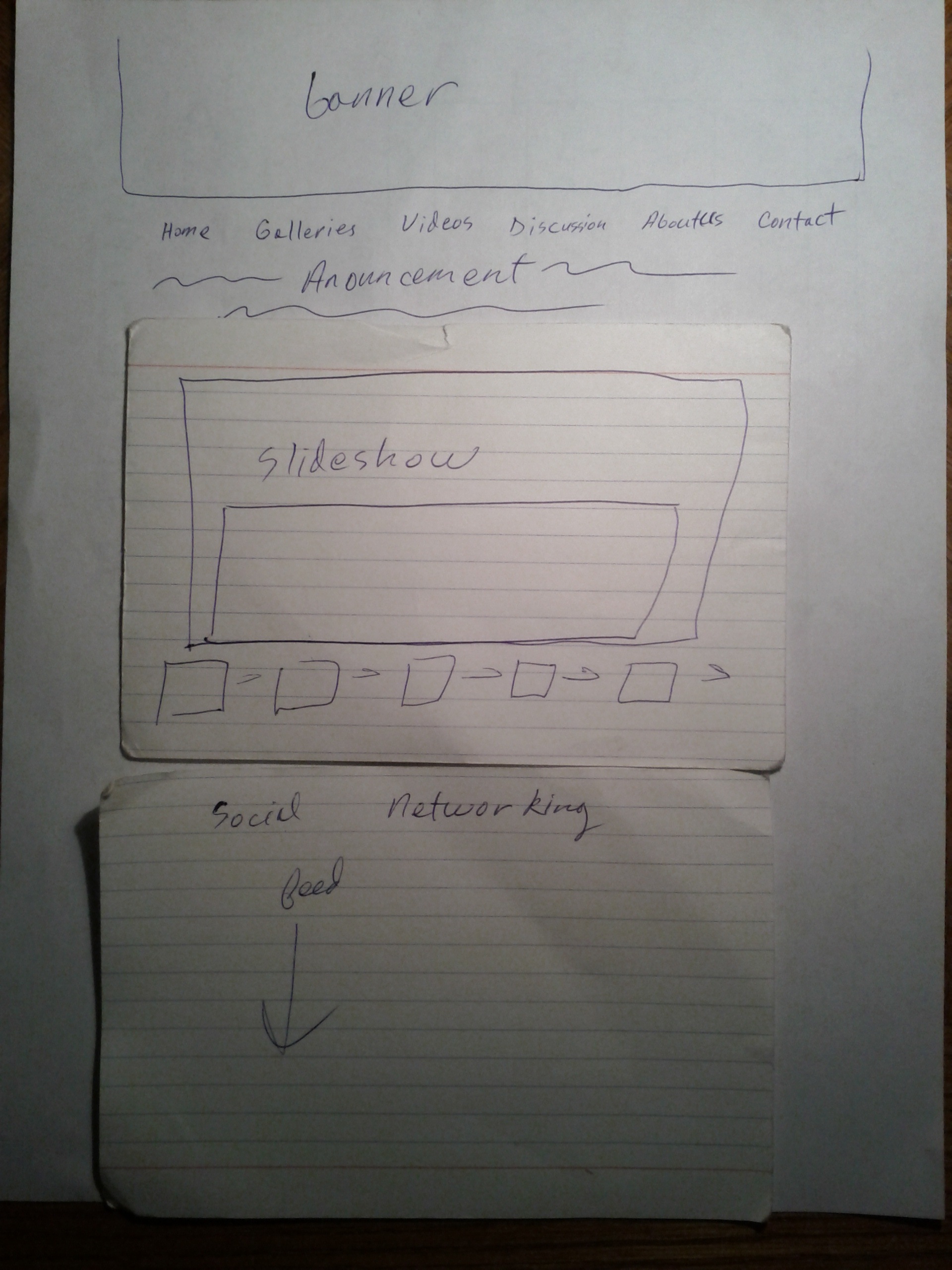
This represents the home page of www.studiolimitlessphotos.com. The banner on the top is part of a theme for the website. Each page linking to the website will have a unique banner related to the page. The navigation is located directly below the banner and is oriented horizontally. Underneath the navigation are small announcements describing new things the company has done or things that would be of interest to our customers. Below that will be the main attraction to the page which is a slide show of some of our work. Below the slideshow is a facebook feed where users can connect with other users and discuss the company.
This represents the home page of http://www.studiolimitlessphotos.com. The banner on the top is part of a theme for the website. Each page linking to the website will have a unique banner related to the page. The navigation is located directly below the banner and is oriented horizontally. Underneath the navigation are small announcements describing new things the company has done or things that would be of interest to our customers. Below that will be the main attraction to the page which is a slide show of some of our work. Below the slideshow is a facebook feed where users can connect with other users and discuss the company.
CRITIQUE OF MSU.EDU
MSU’s homepage is surprisingly a pretty good looking site. It is very easy on the eyes, simple, and the colors all blend. Navigation to and from other pages is very easy. Everything is located at the top of the page just where you’d expect them to be and labeled appropriately. There is a nice slide show in the center of the page that catches the users attention as well as providing interesting informative links. The pages is nice also in the way it doesn’t need to scroll. Everything fits right in the center of the page and that makes it very easy to use.
Critique of panic.com
Panic.com has a very friendly and fun UI. The colors are playful and the whole look of the site seems fun. Navigation is a bit different because there isn’t really a navigation bar. Instead there are buttons on the home page for each individual product panic deals with. The problem with that is it becomes slow to navigate from the various pages outside of home. Instead of one click to every page, you might have to do two. The serial numbers app near the bottom of the page was very interesting. Might make things very easy for users of their products.
Company Introduction
At Studio Limitless we strive to recreate happiness in the form of a photo or video. Life’s moments are precious. Your babies first birthday, your son/daughters graduation, or even your own wedding are all things that one wants to remember.
At Studio Limitless we have at the least 2 photographers and cameras capturing every angle creating a natural scene of happiness. With our pictures every smile is natural and every kiss is magical. Our best quality is a touch of humanity. We will work with you to create the best package that fits your budget. No one should have to settle for less, so let us give you more.
3 Unix text editors
Although I typically work in OSX I do often use Windows and Linux platforms. Right now I will focus on the Unix based editors. I will focus on 3 and will try to convince you on why I think the one I use is best.
emacs – This is one editor that I HATE. I know some people who will swear by it. They will say that once you get used to it, it is very handy. I’m not saying that this isn’t true, but for me it definitely wasn’t. It just makes everything hard by straying away from what your used to. Simple tasks like copying and pasting are harder than they need to be. I would not recommend emacs.
TextEdit: This is the default editor that comes with OSX. It does everything you need and behaves as you would expect. If you don’t want to download anything new and just want a simple text editor TextEdit will be fine for you.
Kate – Kate in my opinion is the best text editor. It does everything that you want. It color coordinates things so coding in C++ is made easier. There is a built in terminal which makes running code a breeze. On the side you can see all the files that you are working with as well. Thanks to great organization and functionality Kate is one of the best text editors.
Week 1 Writing Design Critique for http://jasonsantamaria.com/
http://jasonsantamaria.com/ is a simple looking site at first glance. The colors white black and red are used in great contrast with each other. Everything seems good, except for the site organization. At one point you realize that there is just too much going on at one time. Especially in the articles page. This however isn’t too big of a problem and one can easily get used to the site layout. Overall the site isn’t bad. The colors are nice on the eyes and once you get used the layout, navigation is pretty easy.
